pyNebulosa: Gene-Weighted Density Estimation for Single-Cell Data
pyNebulosa recovers single-cell gene expression signals using kernel density estimation (KDE). In single-cell RNA-seq, technical dropout causes many genes to appear unexpressed in individual cells, making standard feature plots noisy and hard to interpret. pyNebulosa addresses this by smoothing gene expression across a 2D embedding (e.g., UMAP), weighting each cell’s contribution by its expression level.
How it differs from existing tools:
scanpy.tl.embedding_density: Estimates cell density in embedding space per category. Does not weight by gene expression — only measures how crowded a region is.pyUCell: Computes gene signature scores using rank-based statistics with optional KNN smoothing. A scoring tool, not a visualization method.
pyNebulosa: Uses gene-expression-weighted KDE to reveal where expressing cells are concentrated, smoothing over dropout noise. A gene-level visualization tool.
This tutorial demonstrates pyNebulosa using the PBMC 3K dataset from 10X Genomics.
import matplotlib.pyplot as plt
import scanpy as sc

import pynebulosa as nb

# Load the pre-processed PBMC 3K dataset
adata = sc.datasets.pbmc3k_processed()
print(f"Dataset: {adata.n_obs} cells x {adata.n_vars} genes")
print(f"Cell types: {', '.join(sorted(adata.obs['louvain'].unique()))}")
Dataset: 2638 cells x 1838 genes
Cell types: B cells, CD14+ Monocytes, CD4 T cells, CD8 T cells, Dendritic cells, FCGR3A+ Monocytes, Megakaryocytes, NK cells
Dataset overview
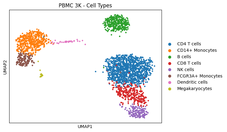
The PBMC 3K dataset contains 2,638 peripheral blood mononuclear cells sequenced with 10X Genomics. After standard preprocessing (filtering, normalization, HVG selection, PCA, UMAP, clustering), 8 cell types were identified.
sc.pl.umap(adata, color="louvain", title="PBMC 3K - Cell Types")
The dropout problem
Standard feature plots (sc.pl.umap(..., color='gene')) show raw expression values per cell. Due to technical dropout in scRNA-seq, many truly-expressing cells appear as zeros, creating a noisy, hard-to-interpret visualization.
Let’s compare scanpy’s standard feature plot with pyNebulosa’s density plot for NKG7, a natural killer (NK) cell marker.
# Side-by-side: standard feature plot vs pyNebulosa density
fig, axes = plt.subplots(1, 2, figsize=(12, 4.5))

# Standard scanpy feature plot
sc.pl.umap(adata, color="NKG7", ax=axes[0], show=False, title="Standard feature plot (NKG7)")

# pyNebulosa density plot
nb.plot_density(adata, "NKG7", ax=axes[1])
axes[1].set_title("pyNebulosa density plot (NKG7)", fontsize=14)

fig.tight_layout()
plt.show()
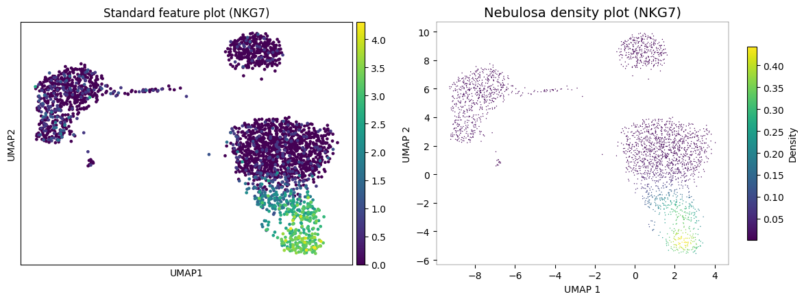
In the standard feature plot (left), NKG7 expression appears scattered with many zero-valued cells obscuring the pattern. pyNebulosa (right) applies gene-weighted kernel density estimation to reveal a smooth density gradient that clearly highlights the NK cell cluster, recovering signal from dropout.
Visualizing multiple markers
pyNebulosa can plot multiple genes at once, creating a panel for each. Here we visualize canonical markers for four cell types:
MS4A1 (CD20): B cells
NKG7: NK cells
CST3: Monocytes and dendritic cells
PPBP: Megakaryocytes
nb.plot_density(adata, ["MS4A1", "NKG7", "CST3", "PPBP"], ncols=2)
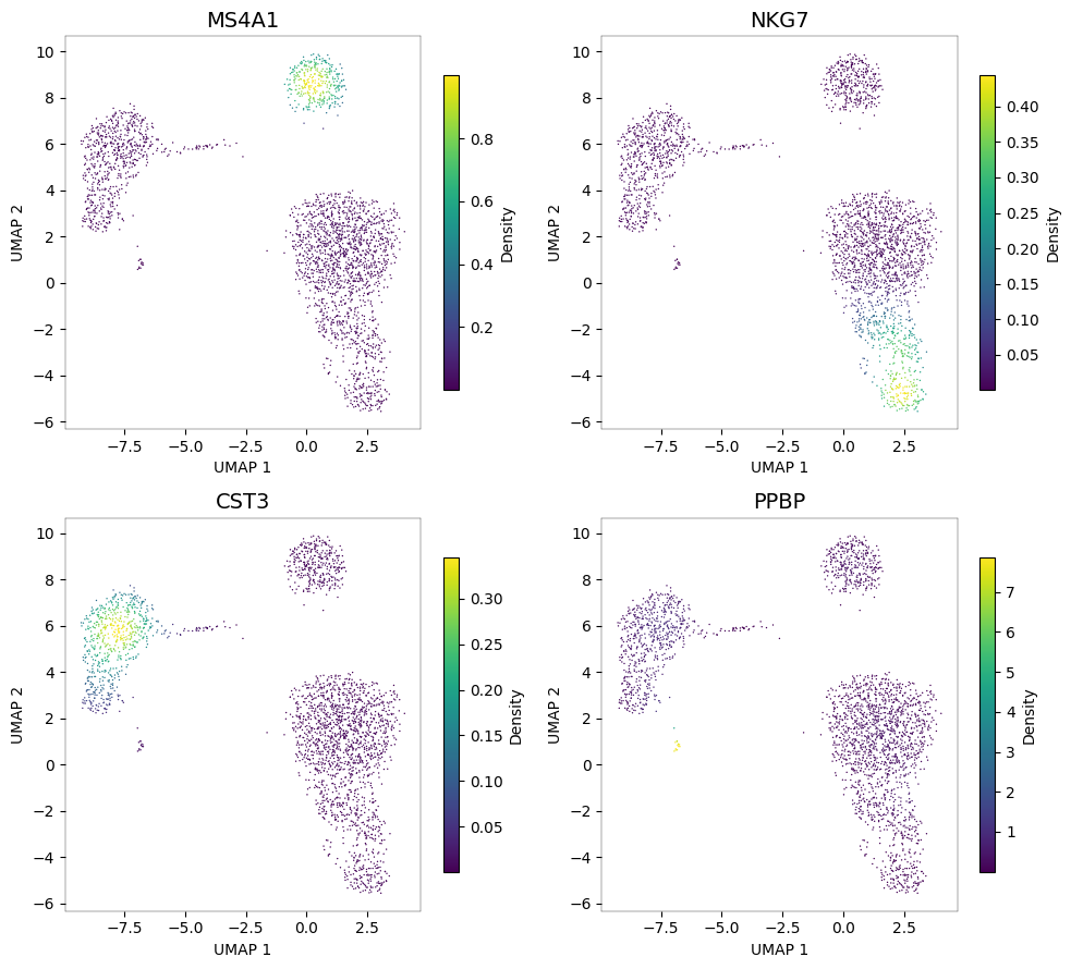
Each panel highlights a different cell population. The density-based visualization makes it easy to identify which UMAP regions correspond to which cell types.
Joint density: identifying cell types by co-expression
When multiple markers define a cell type, pyNebulosa can compute the joint density — the product of individual gene densities. This highlights only regions where all markers are co-expressed, providing a more specific cell type signal than any single marker alone.
NK cells: NKG7 + GNLY
Both NKG7 and GNLY (granulysin) are expressed in NK cells. The joint density pinpoints the NK cluster more precisely than either marker alone.
nb.plot_density(adata, ["NKG7", "GNLY"], joint=True)
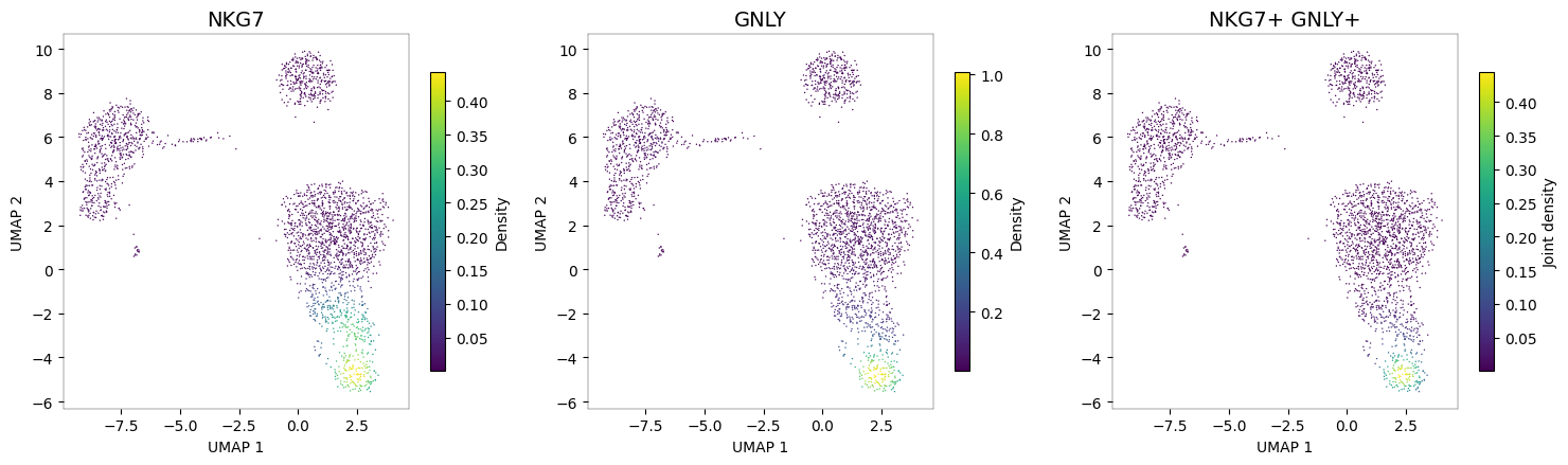
The third panel (joint density) shows a highly specific signal concentrated in the NK cell cluster, where both NKG7 and GNLY are co-expressed.
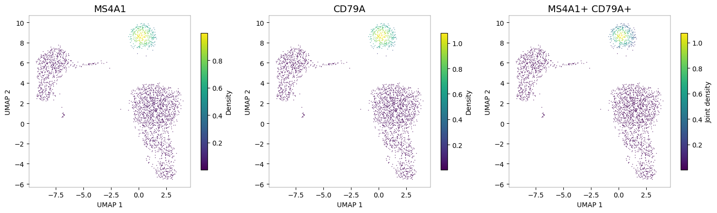
B cells: MS4A1 + CD79A
nb.plot_density(adata, ["MS4A1", "CD79A"], joint=True)
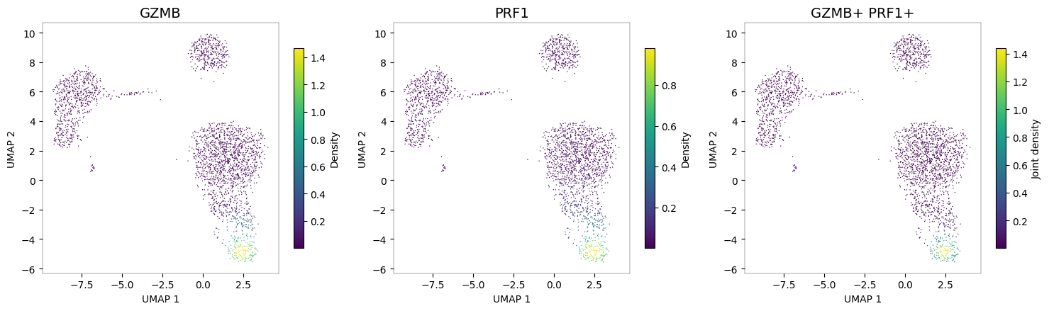
Cytotoxic cells: GZMB + PRF1
Granzyme B (GZMB) and perforin (PRF1) are hallmarks of cytotoxic function, shared between NK cells and CD8+ T cells. The joint density reveals the cytotoxic cell populations.
nb.plot_density(adata, ["GZMB", "PRF1"], joint=True)
Customization
pyNebulosa supports several customization options for fine-tuning your visualizations.
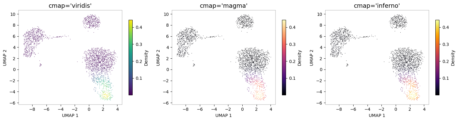
Color palettes
Any matplotlib colormap can be used via the cmap parameter.
# Compare color palettes
fig, axes = plt.subplots(1, 3, figsize=(15, 4))

for ax, cmap in zip(axes, ["viridis", "magma", "inferno"]):
    nb.plot_density(adata, "NKG7", cmap=cmap, ax=ax)
    ax.set_title(f"cmap='{cmap}'", fontsize=14)

fig.tight_layout()
plt.show()
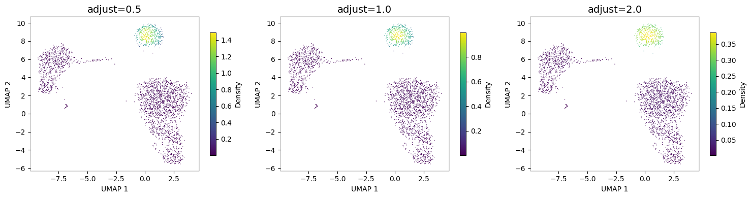
Bandwidth adjustment
The adjust parameter controls smoothing. Lower values preserve more detail; higher values produce smoother density estimates.
# Compare bandwidth adjustments
fig, axes = plt.subplots(1, 3, figsize=(15, 4))

for ax, adj in zip(axes, [0.5, 1.0, 2.0]):
    nb.plot_density(adata, "MS4A1", adjust=adj, ax=ax)
    ax.set_title(f"adjust={adj}", fontsize=14)

fig.tight_layout()
plt.show()
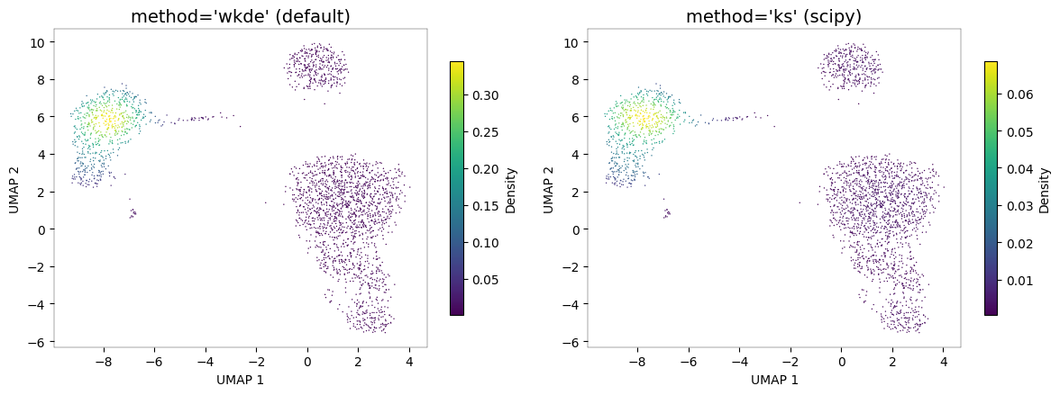
KDE methods
pyNebulosa supports two KDE methods:
"wkde"(default): Custom weighted 2D KDE with Silverman bandwidth selection"ks": scipy’sgaussian_kdewith weighted observations
# Compare KDE methods
fig, axes = plt.subplots(1, 2, figsize=(12, 4.5))

nb.plot_density(adata, "CST3", method="wkde", ax=axes[0])
axes[0].set_title("method='wkde' (default)", fontsize=14)

nb.plot_density(adata, "CST3", method="ks", ax=axes[1])
axes[1].set_title("method='ks' (scipy)", fontsize=14)

fig.tight_layout()
plt.show()
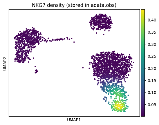
Programmatic access to density values
For downstream analysis, you can compute density values directly using calculate_density and store them in adata.obs.
import numpy as np

# Compute density for NKG7 and store in adata.obs
embeddings = adata.obsm["X_umap"]
nkg7_expr = np.asarray(adata[:, "NKG7"].X).flatten()

adata.obs["NKG7_density"] = nb.calculate_density(nkg7_expr, embeddings)

# Now usable with any scanpy plotting function
sc.pl.umap(adata, color="NKG7_density", title="NKG7 density (stored in adata.obs)")
Saving figures
Plots can be saved directly using the save parameter.
# Save a joint density plot to a file
nb.plot_density(
    adata, ["NKG7", "GNLY"], joint=True,
    save="nk_joint_density.png", show=False
)
print("Saved to nk_joint_density.png")
Saved to nk_joint_density.png
Summary
pyNebulosa provides gene-weighted kernel density estimation for single-cell data visualization, filling a gap in the Python/scanpy ecosystem.
Key functions:
Function |
Purpose |
|---|---|
|
Main visualization function |
|
Compute density values programmatically |
|
Low-level weighted 2D KDE |
Key parameters for plot_density:
Parameter |
Description |
Default |
|---|---|---|
|
Compute joint density for multiple features |
|
|
|
|
|
Bandwidth adjustment factor |
|
|
Matplotlib colormap |
|
|
Key in |
auto-detect |
|
Expression data layer |
|
Installation: pip install pynebulosa